This layout was scraplifted from a layout in this issues of Scrap 365. I have to admit that the first time I read this new magazine, whilst I admired the range of different projects, I found the writing a bit of a mixed bag, and I didn't think it held together as a single publication very well. Now though, having just read Issue 4, I'm really starting to like it. The layouts and other projects are beautiful and there are a lot of useful tips.
The inspiration page by Kim Woods looked like this:
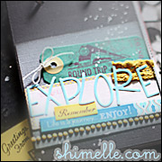
and, other than turning it 90 degrees and making it a bit bigger, I stuck fairly closely to the original. In fact, I've just realised that the photos are very similar too.The paper panels are all scraps and I used up a variety of alphas. The glittery flowers were created with Papermania Motifations and superfine glitter.










3 comments:
This is lovely Kirsty; I do love it when a mag article can inspire you beyond turning the page corner down! agree with you about the mag too...think it's 'embedding' a bit now!
What a nice page Kirsty. I like that strip of lace along the side & your choice of colors.
Love your "twist" on the lift. impressive page
Post a Comment