

I made this layout backwards, mainly because I was too impatient to wait until I had time to work on it in the normal way so I did each stage as and when I could over the course of a day.


You are here to learn the subtle
science and exact art of potion-making. As there is little foolish wand-waving
here, many of you will hardly believe this is magic. I don't expect you will
really understand the beauty of the softly simmering cauldron with its
shimmering fumes, the delicate power of liquids that creep through human veins,
bewitching the mind, ensnaring the senses... I can teach you how to bottle
fame, brew glory, even put a stopper on death — if you aren't as big a bunch of
dunderheads as I usually have to teach."
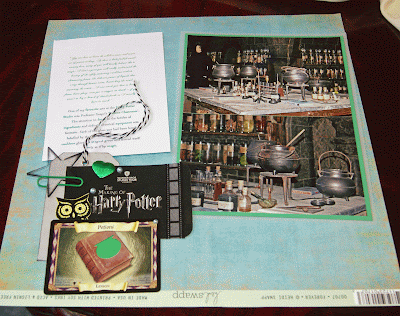
One of my favourite sets at the Harry Potter Studio was Professor Snape’s ‘Potions Classroom’. The attention to detail in the bottles of ingredients and delicate chemical equipment was fantastic. Each
of the glass jars had been hand-labelled by the 200-strong props team. One cauldron glowed a magical green and stirred itself slowly as if by magic.
When I got to this point I remembered I had seen Shimelle do something similar in her class 'Explore' a couple of summers ago, so I went back and rewatched the videos for inspiration. I love that, having paid for a class at shimelle.com, I have permanent access to the archives.
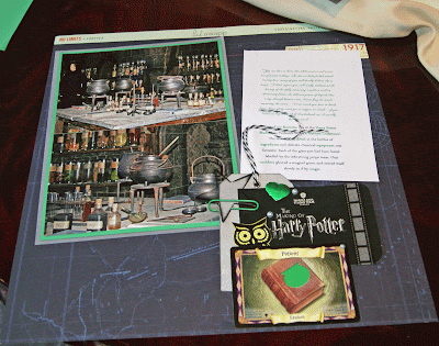
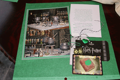
The final stage was to decide on a background. Although I love both sides of the blue Heidi Swapp map/compass print, the colours didn't work and I finally opted for glossy Bazzill Basics black layered on green Core'dinations cardstock. No patterned papers at all.
These stages had taken the whole day on and off but the rest of the layout came together quickly after that. I added a title with 2 fonts. (Useful hint to self: the black tile letters are not self-adhesive so I spelled out the word 'details' on a strip of double-sided tape which made it much easier to move it around on the page before pulling off the backing paper and sticking it down.)
 I finished off the page with more of the film strip washi tape, acrylic shapes adhered with Glossy Accents and adhesive pearls, all of which I had started with. I really like how the process came full circle and I'm pleased with the final page. As a bonus, my husband's comment when he saw it was "Very green. Very Slytherin!" I hadn't even thought of that!


The final stage was to decide on a background. Although I love both sides of the blue Heidi Swapp map/compass print, the colours didn't work and I finally opted for glossy Bazzill Basics black layered on green Core'dinations cardstock. No patterned papers at all.
These stages had taken the whole day on and off but the rest of the layout came together quickly after that. I added a title with 2 fonts. (Useful hint to self: the black tile letters are not self-adhesive so I spelled out the word 'details' on a strip of double-sided tape which made it much easier to move it around on the page before pulling off the backing paper and sticking it down.)


5 comments:
I love the title of your post, I love the story and the pictures and the way you have pulled it all together. Great stuff!
It looks great. I love the colours you've chosen for them.
I love the colors your chose for this - they're perfect!
Rinda
No matter how you did it...it looks great!
Alison xx
Backwards or not it looks fabulous. Well done, adaptive you!
Post a Comment