Subscribe to:
Post Comments (Atom)
skip to main |
skip to sidebar


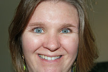
Welcome!
Welcome to my blog. I hope you enjoy looking at some of the pretty things I've been making.


Blogs I Love
Labels
Archive
Contact me!
I love receiving mail! Please leave a comment on my posts, or feel free to email me at
kirsty.a@live.co.uk
kirsty.a@live.co.uk
Followers
About Me

- Kirsty.A
- I'm a part-time ESOL teacher in Surrey, England. Working at both a Sixth Form College and in the community, I teach a range of learners from German Au Pairs to Pakistani housewives, who provide me with an endless supply of anecdotes. We follow the Skills for Life curriculum and our students sit Cambridge Skills for Life exams. I also teach Cambridge Certificate of Advanced English.
Blog contents © Handmade By Kirsty 2010. Blogger Theme by NymFont, customised for Handmade by Kirsty.





2 comments:
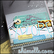
I like the colours Kirsty - the brown and blue work well together :-) If you really want to change it though I suppose you could lessen the impact of the vertical brown strip, perhaps by layering something blue - ribbon or a paper strip? But I do really like this layout as it is xx
See, I like brown so it looks good to me!
Post a Comment