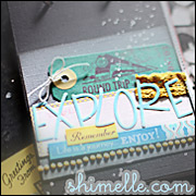
Kirsty suggested that we look through our favourite recent layouts to identify the common elements, then use them to create our own sketch. This is something I haven't done before, but I know my style has changed recently and I was quite surprised to see what the common elements were from my 6 favourites:
- A 12x12 cardstock background, with a large sheet of patterned paper on top, leaving a border;
- Torn and/or inked edges;
- 3 photos, with a focal one printed larger or matted to make it stand out;
- This means not much white space (I really admire people who use white space, but I can't seem to do it);
- One or two journalling blocks - computer printed or hand-written;
- A triangular placement, with everything in 3s;
- Clusters of embellishments.
This has been a very busy week - second week of classes, which always means a pile of marking, plus my AS exam. My house is a tip and i have promised myself that the housework and marking must come before scrapping. I'll have a go at using my sketch for a layout as soon as I have some time to myself.
I think this is going to be an interesting class, as I struggle to work with other people's sketches. Is anyone else doing it too?


5 comments:
I signed up for it, but have yet to do anything with it!
It sounds like scrapping time may be needed as reward time - it's pesky when life gets in the way!
I look forward to seeing what you come up with!
I'm not in that class but have noticed it mentioned on several other blogs I read. Looking forward to seeing your sketch & layout - hope the cleaning & marking go quickly.
I signed up because I loved the idea of making a donation to the Guides, but I have been meeting deadlines this week and have yet to give it the attention it deserves!
I'm doing this class too! X
Post a Comment